LAB RDI Journal
This article explores the lost connection between urban planning and interface design, arguing that integrating UX/UI principles can significantly enhance urban environments by improving usability, accessibility, and user experience.
Author:Harri Heikkilä
Understanding how people perceive their surroundings is a fundamental question in urban planning, central to Kevin Lynch’s influential work The Image of the City (1960). Lynch explores how residents form mental images of the built environment, paralleling how user interface (UI) research examines user interactions with digital interfaces.
Although Lynch did not explicitly use the term ”interface,” his conceptualisation effectively serves as one, illustrating how residents engage with the urban ”service system.” He identified five key elements that structure the mental maps inhabitants form in the city: paths, edges, districts, nodes, and landmarks (picture 1). These elements help users understand the spatial environment, orient themselves and navigate the space. Lynch aimed to design cities that foster robust mental maps among inhabitants, making the environment highly imageable – clear, legible, and inviting greater attention and participation (Lynch 1960, 10 ). Just as paths guide users through a city, navigation menus and icons guide users through a website or app.
The framework mentioned shares interesting similarities with the principles of digital design, particularly those outlined by Donald Norman in ”The Design of Everyday Things” (Norman 1988). Norman introduced concepts such as affordances and natural mapping, emphasising the importance of aligning systems with users’ cognitive models to improve usability and understanding (Norman 2013, 26-28). Affordances refer to both the perceived and actual properties of an object that determine its possible uses, while natural mapping involves the intuitive arrangement of controls and displays to make them easy to use.
By deliberately viewing the city as an interface and examining it from the perspective of UI/UX design, we can explore how urban planning might benefit from interface design principles, and how these fields could inform each other meaningfully. Lynch’s work on the legibility of city environments is analogous to navigation design in interfaces; both aim to help users orient themselves and navigate the space effectively. The ”generalised mental picture” that Lynch discussed is akin to a mental model in UI/UX design – our understanding of how things work and how we can interact with the system. In urban planning, this system is the city; the interface is the set of elements the city provides for interacting with its services. The interface is what the user sees, and therefore, for users, it is the service – the interface becomes synonymous with the product or service itself (Cooper et al. 2014; Krishna 2015).
Human decision-making and behavior depend on how we perceive our environment (Ahola & Mugge 2017). Our brain actively interprets information from our senses, enabling us to navigate physical and digital environments effectively. This quick process, taking place in milliseconds (Trafton 2014), is crucial in designing user-friendly cities and interfaces. Urban planning should consider human subjective perception, drawing insights from user interface design and user experience scholars.
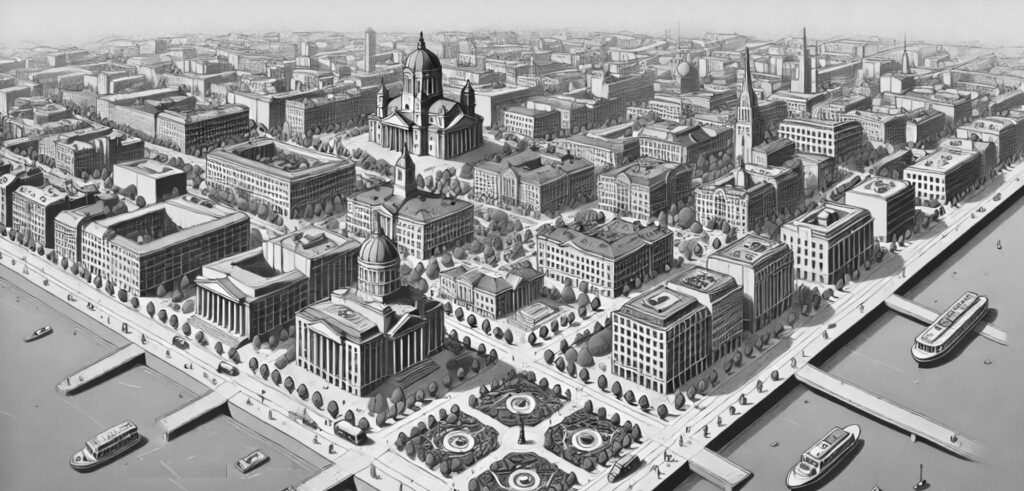
Picture 1. Lynch’s (1960) vision of the city comprises visual elements with distinct functions, identified through his research as five interconnected elements: Paths (routes like streets or canals), Edges (boundaries such as rivers or walls), Districts (areas with a unique identity), Nodes (key meeting points like squares), and Landmarks (recognisable points like towers or statues). (Image: Dalle-E)
Applying Nielsen’s 10 usability heuristics to urban planning
I have attempted to apply Nielsen’s 10 usability heuristics to the field of urban planning and spatial design, providing concrete examples to support my work. This effort is built upon my ongoing work to revise Nielsen’s 10 heuristics (Heikkilä, 2024), and also draws from references such as Wäistö (2021, 30-33) and Calori & Vanden-Eynden (2015).
1. Visibility of system status
In UI design, systems should always keep users informed about what is currently happening. In urban space, this could mean that cities should leverage real-time data to keep citizens informed not only about forthcoming or current developments, such as construction projects but also about the amount of traffic or alteration of routes. IoT-sensors could be used effectively to gather data and smart road signs to display construction updates or expected completion dates, enhancing transparency and allowing residents to adjust their routines accordingly. Real-time transit apps and dynamic signage could provide more value.
2. Match between system and the real world
Interfaces should speak the users’ language, using familiar concepts, recommends Nielsen. It is easy to apply this rule for different kind of public information in cities, but maybe this could also be turned to recommendation for public spaces and parks to mimic natural landscapes to become more inviting and understandable. Similar to how skeuomorphic design in interfaces uses familiar visuals to improve user comfort. Psychological research confirms that these natural elements positively impact urban residents’ stress as well (Chen et al 2021).
3. User control and freedom
User should be able to easily understand the layout of the space, select the most logical route, and rectify any errors they may make, like choosing the wrong path. In physical spaces this means that entrances and exit-routes should be marked clearly. Providing citizens with various transportation options, such as cycling, walking, or public transport, enables them to choose the most convenient mode. Clear signage and multiple transportation options empower users.
4. Consistency and standard
Consistency in digital design reduces confusion as much as in physical space. Employing uniform signage and urban design elements across different parts of the city can enhance wayfinding. Standardised street signs and pedestrian navigation aids help residents and visitors navigate the city with ease. Other parts of the system should follow the same logic; the user does not need to learn new things in each part and can handle basic tasks routinely, minimising the user’s cognitive load.
5. Error prevention
Interfaces should be designed to prevent errors. In urban planning, creating layouts and systems that minimise the risk of accidents—such as well-placed pedestrian crossings and traffic-calming measures—can improve safety. Design should aim to direct the user’s attention to the right things and help them make the right choices, even without explicit signs or instructions.
6. Recognition rather than recall
Minimizing the load on the user’s memory improves usability. Making information, facilities, and landmarks easily recognizable reduces the need for citizens to remember locations. Iconic landmarks or colour-coded areas can act as navigational aids, helping people orient themselves within the city. Providing users with the right information at the right time helps them anticipate what will happen next and what is required from them.
7. Flexibility and Efficiency of Use
A great system empowers users to tailor it to their preferences. Urban designs that cater to new visitors and seasoned residents can improve overall efficiency. Adaptive public transport systems that provide express options for regular users and simple routes for newcomers demonstrate this flexibility. These options should be easily identifiable in advance, and users should be able to impact the surrounding space and its features.
8. Aesthetic and minimalist design
Interfaces should not include irrelevant information. Both urban planning and interface design strive to balance aesthetics with functionality. In city planning, this might involve designing public spaces that are both beautiful and practical, enhancing the quality of interactions between inhabitants and their environment. Interface design involves creating visually appealing and user-friendly layouts and elements. Applying aesthetic design principles like harmony goal-directedly in urban planning is important not for intrinsic value but for mental well-being and health (Seresinhe et al. 2015) and for positive overall development of the area (Carlino & Saiz 2019).
The principle of minimalism considers the limits of human perception, emphasising a human scale in architecture, known to promote active social networks, universal access, sustainability and to solve congestion issues (Moan 2014). Designing with the mind in mind realises that each additional piece of information competes with relevant information, thereby reducing overall visibility. The minimalism-inspired Calm design -movement of the UI design may have relevant application here (Heikkilä 2023).
9. Help users recognize, diagnose, and recover from errors
Systems should provide clear error messages and solutions. Providing accessible information and assistance for navigating mishaps—such as missed transport connections or wayfinding mistakes—can improve user experience. Information kiosks or mobile applications offering immediate alternatives and solutions for disrupted travel plans exemplify this approach.
10. Help and documentation
Even though a system should be usable without documentation, it may be necessary to provide help while avoiding information overflow. Ensure that resources like maps and guides are readily available to assist those needing guidance. Comprehensive, easy-to-understand city guides and interactive digital maps accessible via mobile devices support this heuristic. Modern tools like mobile apps can offer real-time assistance to city dwellers.
Integrating contemporary UX/UI-ideas into urban planning
The issue here is that while Nielsen’s 10 heuristics are the most commonly used, they are outdated in terms of interface design. These heuristics were developed in a different digital era with varying user needs. Although other heuristics are available, they still do not effectively tackle problems such as navigation, affordances, aesthetics, and readability (Heikkilä 2012, 19-20; Heikkilä 2024, items 11–13).
Modern UI design focuses on creating an intuitive and seamless interface that enables natural navigation without barriers. It aims to achieve a flow where the user feels directly involved in the task without being hindered by the system coming in-between. This is achieved by subtly guiding the user’s choices rather than dictating them, creating what’s known as a ”thin interface.” This involves even striving for an “interface without an interface” (Krishna 2015), or more realistically minimal interface, something that creates no barriers between user intentions and the tool used. The idea is to challenge the over-reliance on screens and traditional interfaces, advocating instead for more seamless, natural interactions that minimize visible UI elements, allowing users to interact directly with the service without barriers or distractions. The user is guided to make desired choices by “nudging”, in a friendly and non-jostling way making them more appealing – and the whole using enjoyable or maybe even fun. (Heikkilä 2023).
What does this mean for urban planning? A similar approach would involve intentionally promoting the desired choice among available options in a positive manner, by making the desired choices more affordable and easy, rather than by restricting choices in a negative way. For example, if we want people to spend more time in their neighborhoods and not move to more distant areas in private cars in search of services, we should create a service interface that makes local choices more attractive, instead of making it more complicated to move farther away. To be successful, this requires that we do not allow oversized shopping malls that draw purchasing power from wide areas. Instead, we could design local shopping boulevards with greenery and cafes as the center of a new district. This type of boulevard or esplanade would not only be a positive choice, but it would also serve a similar function as a “desktop” user interface metaphor – it is easy to understand where the services are when they are all visible, in this case, along a linear path. This creates a strong mental map, helping to position oneself in the area and helping to create a likable personality for the area to identify with. These kinds of leafy shopping boulevards are missing from newly built neighborhoods in Helsinki but are lovable and distinct features in older districts like Munkkiniemi.
In contemporary UI design, it’s important not to overwhelm short-term memory by avoiding crowded web pages and large drop-down menus. Instead, the goal is to present a manageable amount of information that users can easily digest. Similarly, in urban planning, the focus should be on constructing more medium-density buildings and prioritizing human-scale structures over high-rises. Gehl (2010) discusses the importance of creating streets and public spaces that feel enclosed yet open enough to be inviting. This can be achieved with buildings that are approximately 4 to 6 stories tall, but Gehl does not give an exact number. Encouraging higher density without sacrificing the human scale of buildings and streets could be the solution based on psychology. This means designing buildings and public spaces that feel comfortable and accessible, preventing feelings of overcrowding or alienation (Montgomery 2013).
In UI design, we aim to make digital surroundings recognisable and familiar to users. This involves using elements that are already known to make recognition effortless. The same principle can benefit urban environments by incorporating familiar and distinct shapes. Research by Brielmann et al. in 2012 supports this idea, suggesting that modernist environments with pure geometrical forms, like squares and cubes, a general lack of details, and restricted color charts are perceived as more meaningless than environments with traditional and organic shapes.
This approach is also grounded in concepts of placemaking and urban sociology, which emphasise that well-designed public spaces encourage people to stay within their communities, promoting local economic activity, social interaction, and environmental sustainability (Montgomery 2013) and human urban scale, which promotes social sustainability. These kind of ideas have of course been around for a long time in the works of Gehl (2010) and Sim (2019) but it seems that UI design has something yet to add on. Gehl (2010) has listed 12 key quality criteria for public spaces but does not say much about perception and navigation.
Possible examples of integrating UI/UX methods into urban planning
While modern city planning is increasingly user-centric, incorporating specific UI/UX design strategies could further enhance the process. Methods such as ethnography, user experience studies, usability testing, workshops, interviews, and personas are common to both fields. However, certain techniques prevalent in UI/UX design – like A/B testing and interactive prototyping – are less commonly applied in urban planning.
A/B testing with digital twins
Digital twins, virtual representations of real-world entities, are increasingly used in urban planning and political decision-making. There have been applications and considerations of testing different variations with digital twins in urban planning but no implementation of actual A/B, there are no frameworks for it, yet.
A/B testing is a standard method in UI/UX design for evaluating user preferences between two versions of an interface; it could be adapted to city planning by comparing different detailed design scenarios. For example, two versions of a city square could be created with varying placements of benches, greenery, or public art – not to mention testing different signage systems. Altering the placement and size buildings, entrances and pathways allows for evaluating different configurations before physical implementation. Citizens and stakeholders could also ”experience” these versions through extended reality (XR) technology, providing feedback on their preferences. This approach could help people feel more connected to their surroundings and promote social sustainability and civic engagement.
Moreover, this type of adjustable game engine-based co-creation environment could enhance the realism of traditional architectural renderings by enabling adjustments to the time of day, weather and season. There is a valid concern about the over-idealization of these visualisations (Kutyla 2015). Often, these models are crafted to appear ”too perfect,” typically depicting a sunny day with well-dressed individuals, lush trees, and birds soaring in the sky (Picture 2). Overly polished portrayal of urban spaces may not accurately reflect the actual outcomes and could mislead decision-makers who may not be accustomed to interpreting this type of imagery. Prior to 3D renderings, plans were presented as handmade mockups, clearly indicating that they were sketches, not depictions of forthcoming reality. In this scenario, the visuals function more as marketing tools than as precise planning aids, potentially resulting in misguided expectations or dissatisfaction when the final results differ from what was portrayed (Korenhof et al. 2021).
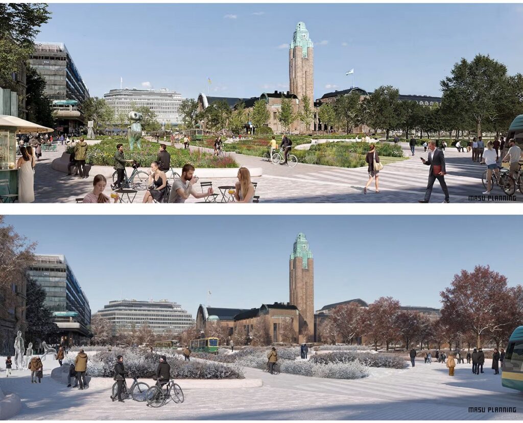
Picture 2. The visualisations promoting the new city centre of Helsinki depict a sunny city with young people and trees retaining their leaves even in winter. How would this look with a game engine that allows for changing details such as weather, time of day, and demographics of the people shown? (Images: Masu Planning 2024, 23–24)
Prototyping with extended reality (XR) technologies
XR technologies allow for immersive simulations of urban spaces using tools like VR glasses. These simulations can incorporate environmental data to assess how design changes impact factors such as sunlight exposure, wind patterns, and green space distribution, promoting sustainable urban development. Additionally, XR can facilitate community engagement by allowing residents to interact with different design options and provide immediate feedback, ensuring their voices are heard in the planning process. Interactive feedback loops enable residents to contribute to the planning process while involving diverse users in testing can help identify and address accessibility issues, creating inclusive spaces for people of all ages and abilities. This participatory approach values community input and can lead to more responsive urban environments. It may also help to recognise unsustainable solutions that can create alienation and weaken social bonds (Gifford 2007).
By combining UI methods such as Nielsen’s use of usability heuristics with the use of A/B Testing in digital twins, we can encourage innovations in how we design and interact with urban spaces. This interdisciplinary approach could lead to more user-friendly urban environments, to cities that are functional and provide a better user experience for everyone.
Conclusions
When we look at the city as an interface, we are forced to consider how people perceive the built environment. Combining UI/UX methodology with traditional city planning approaches could help us make better design decisions and find new ways to test and implement these decisions to build more human-friendly environments.
The physical and digital user experiences are influenced by similar factors, as reflected in connections between Lynch’s, Norman’s, and Gehl’s work. This highlights the necessity to further integrate these approaches perhaps as a matrix of urban heuristics. This kind of work would require not only a multidisciplinary but a cross-disciplinary approach, where psychology, interface design, architecture, and sociology would come together.
Integrating UX/UI principles into urban planning presents challenges, such as difficulties in integrating these concepts into existing decision-making processes and resistance from traditional planning bodies. This novel perspective may seem fragile due to concerns about feasibility and practicality. However, the intention is to open discussion and create pressure for change. This study aims to stimulate dialogue, encouraging stakeholders to reconsider traditional practices and explore new possibilities for more user-friendly urban environments.
References
Ahola, M. & Mugge, R. 2017. Safety in Passenger Ship Environments: The Influence of Environmental Design Characteristics on People’s Perception of Safety. Applied Ergonomics. Vol. 59, Part A, 143-152. Cited 20 Sept 2024.
Available at https://doi.org/10.1016/j.apergo.2016.07.021
Brielmann, A.A., Buras, N.H., Salingaros, N.A. & Taylor, R.P. 2022. What Happens in Your Brain When You Walk Down the Street? Implications of Architectural Proportions, Biophilia, and Fractal Geometry for Urban Science. Urban Science. Vol 6 (1), 3. Cited 25 Sept 2024. Available at https://doi.org/10.3390/urbansci6010003
Calori, C. & Vanden-Eynden, D. 2015. Signage and Wayfinding Design: A Complete Guide to Creating Environmental Graphic Design Systems. Hoboken, New Jersey: Wiley.
Carlino, G. A. & Saiz, A. 2019. Beautiful City: Leisure Amenities and Urban Growth. Journal of Regional Science. Vol. 59 (3), 369–408. Cited 20 Sept 2024. Available at https://doi.org/10.1111/jors.12438
Cooper, A., Reimann, R., Cronin, D., & Noessel, C. 2014. About Face: The Essentials of Interaction Design. Hoboken, New Jersey: Wiley.
Chen, K., Zhang, T., Liu, F., Zhang, Y., & Song, Y. 2021. How Does Urban Green Space Impact Residents’ Mental Health: A Literature Review of Mediators. International journal of environmental research and public health. Vol. 18 (22), 11746. Cited 18 Sept 2024. Available at https://doi.org/10.3390/ijerph182211746
Gehl, J. 2010. Cities for People. Washington, D.C.: Island Press.
Gifford, R. 2007. The Consequences of Living in High-Rise Building. Architectural Science Review. Vol. 50 (1), 2-17. Cited 18 Sept 2024. Available at https://doi.org/10.3763/asre.2007.5002
Heikkilä, H. 2012. Towards tablet publication heuristics: Improving accessability, usability and user experience with new expert evaluation. Cited 16 Sept 2024. Available at https://research.aalto.fi/en/publications/towards-tablet-publication-heuristics-improving-accessability-usa
Heikkilä, H. 2023. Towards unifying human design principles for the IOT-era. LAB RDI Journal. Cited 19 Sept 2024. Available at https://www.labopen.fi/en/lab-rdi-journal/towards-unifying-human-design-principles-for-the-iot-era/
Heikkilä, H. 2024. Nielsen 10+. Unpublished work in progress. Cited 19 Sept 2024. Available at https://www.dropbox.com/scl/fi/k2wis5u4jz9a2zmq91uaj/Nielsen10-2022-eng_beta.pdf?rlkey=jrlmtwi2f55se2l655zz4diyk&dl=0
Kutyla. J. 2015. Are 3D renderings deceiving architects and clients? ArchDaily. Cited 21 Sept 2024. Available at https://www.archdaily.com/774853/are-3d-renderings-deceiving-architects-and-clients
Krishna, G. 2015. The Best Interface is No Interface: The Simple Path to Brilliant Technology. Indianapolis: New Riders Publishing.
Korenhof, P., Blok, V. & Kloppenburg, S. 2024. Steering Representations – Towards a Critical Understanding of Digital Twins. Philosophy & Technology. Vol. 34, 1751-1773. Cited 29 Sept 2024. Available at https://doi.org/10.1007/s13347-021-00484-1
Lynch, K. 1960. The Image of the City. Cambridge, Massachusetts: MIT Press.
Masu Planning. 2024. Kaivokadun ympäristösuunnitelma. Cited 30 Sept 2024. Available at https://ahjojulkaisu.hel.fi/2CECEAAA-86B2-C722-9971-91DB40E00001.pdf
Moan, P.C. 2014. Eight Bountiful Benefits of the Human Scale. Good human habitat. Cited 19 Sept 2024. Available at https://goodhumanhabitat.org/the-human-scale/benefits-of-the-human-scale/
Montgomery, C. 2013. Happy City: Transforming Our Lives Through Urban Design. New York: Farrar, Straus and Giroux.
Nielsen, J. 1994. 10 Usability Heuristics for User Interface Design. Nielsen Norman Group.
Norman, D. A. 2013. The Design of Everyday Things, Revised and expanded edition. Hachette: Basic Books.
Seresinhe, C., Preis, T. & Moat, H. 2015. Quantifying the Impact of Scenic Environments on Health. Scientific Reports. 5, 16899. Cited 19 Sept 2024. Available at https://doi.org/10.1038/srep16899
Sim, D. 2019. Soft City: Building Density for Everyday Life. Washington, D.C.: Island Press.
Trafton. A. 2014. In the blink of an eye. MIT news. Cited 29 Sept 2024. Available at https://news.mit.edu/2014/in-the-blink-of-an-eye-0116
Wäistö, P. 2021. Toimiva tila : Kolme tapaustutkimusta tilan käytettävyydestä ja mahdollisuuksista sen kehittämiseksi. YAMK-opinnäytetyö. LAB-ammattikorkeakoulu, Kulttuurialan koulutus. Lahti. Cited 19 Sept 2024. Available at https://urn.fi/URN:NBN:fi:amk-202101221436
Author
Harri Heikkilä PhD (arts), MSc (sociology) is principal lecturer (Visual communication, UX/UI) at LAB University of Applied Sciences, Institute of Design and Fine Arts preparing participation for European initiatives of building sustainable environments.
Illustration: Harri Heikkilä
Reference to this article
Heikkilä, H. 2024. The lost connection between urban planning and interface design: Ideas towards a re-enactment. LAB RDI Journal. Cited and date of citation. Available at https://www.labopen.fi/en/lab-rdi-journal/the-lost-connection-between-urban-planning-and-interface-design-ideas-towards-a-re-enactment/