LAB RDI Journal
Ubiquitous computing has created a noisy and crowded cognitive environment where dozens of different interfaces and notifications demand our attention during the day. This calls for a new and holistic human approach to common design principles. Luckily, there is no need to start from scratch. Xerox has done the preliminary work already in the 1970s’.
Author: Harri Heikkilä
Xerox Palo Alto Research Center (PARC) has been a historically significant contributor to the development of modern information society. Numerous pivotal inventions were ignited at Xerox PARC – but did not necessarily find their final place in the market by the company itself. There was the iPad-like device of Alan Kay at the start of the 1970s (Kay 1972) and the groundbreaking Mac/Windows like graphic user interface (GUI) for the Alto computer in the late 1970s, to mention a few.

Image 1. Is e-mail an old, old-fashioned way of communication? Calm tech wants to limit notifications in digital life. (Screenshot: Harri Heikkilä)
It is time to return to one of the great ideas at PARC: “Calm tech”
In this article, I will argue that one of the PARC ideas worth re-inventing is the work on “Calm tech” by Weiser and Brown in the middle of the nineties (Weiser & Brown 1995; 1996). With Calm tech, the researchers searched for a solution for information overload in 1995 – well before smartphones, the mainstream Internet, let alone the IoT. A real case of foresight. As Weiser put it, ”when our world is filled with interconnected, embedded computers, calm technology will play a central role in a more humanly empowered twenty-first century” (Weiser & Brown 1996). They concluded that when technology eventually reaches the level of ubiquitousness, it also gains so much space in our everyday lives that it can surpass our capacity to deal with it effectively. Calm tech is a set of design principles to deal with the situation.
Weiser and Brown (1995; 1996) were ahead of their time, but it doesn’t diminish the value of their thinking. On the contrary, it can form a basis for very relevant UX/UI-thinking in the 2020s.
The aim of this article is not only to repeat why the Calm tech approach is more relevant today than it was in the 1990s´ but also to explain why it is not just an idea but more like a design philosophy and set of guidelines that have potential to become an integrative design principle for several other initiatives to cope with the era of ”noisy” ubiquitous ICT technology environment of today.
To achieve this, I will first look at the psychological base of calmness, then reflect on the existing guidelines for the development of technology and finally derive a tentative heuristic list of good practices from the general principles of Calm tech as worded by Amber Case (2015).
The essential question by Case (2015) was: What happens when 50 billion IoT devices are out there? In the ubiquitous era of ICT, the way devices and services communicate with us is crucial. Suppose we were to expand their number but maintain our current level of communication. In that case, we would soon find ourselves buried under an indistinguishable pile of dialog boxes, pop-up boxes, push notifications, and alarms.
Something must be done.
Psychological base
The nucleus of Calm tech is the human attitude and relationship with technology. In the 1990s, in cognitive psychology, the idea of limited capacity resources had long been known. Still, it is somewhat of a mystery why this did not directly contribute more to digital designs. Tech should be designed with the human mind in mind.
However, Calm tech is not about restraining. It is about empowering users by creating an environment where information can be used effectively and with enjoyment and pleasure. Also, the tradition of usability deals with efficiency, but here, we have a more nuanced, user experience-like attitude. As Case (2015) puts it: ”If good design allows someone to get to their goal with the fewest steps, Calm Technology allows them to get there with the lowest mental cost”.
Ergo, Calm tech strives to bring clarity to chaos by appeasing our digital environment optimally, but the idea is not to offer less information; quite the contrary: It involves the seemingly nonsensical idea that to become attuned to more information is to attend to it less (Weiser & Brown 1996, 17). To understand this, we must look at the work of Kahneman (2011), a cognitive psychologist who explains the difference between short-term and long-term memory as two gestalt systems. “First system“works quickly and automatically in the periphery and doesn’t take much effort; it makes quick judgments based on familiar patterns. ”Second system” takes more effort; it requires intense focus on the center and operates methodically.
The psychological point of Calm technology is to effectively engage both the center and the periphery of our attention so that our mind can move back and forth between the two effortlessly. (Weiser & Brown 1995). This requires interfaces to be designed so that we, as users can make the intentional and optimal choice of where to focus our attention. This means UI where the periphery does not call our attention by unnecessary alarms, annotations, blinking links, intrusive colors, shapes, etc.
Today, we have a huge and growing number of different interfaces and information ahead of us. Therefore, this entity should be designed as a hierarchy, where the most important things can be dealt with first. If you are driving attention to everywhere, you are not driving it anywhere. Especially environments requiring fast decision-making with potentially hazardous consequences, like dashboards of vehicles or payment terminals, should be designed as noiseless as possible, favouring tranquil user interfaces guiding our eyes and calling out attention logically and only when needed. In one sentence: We need a Steve Jobs for the IoT – a strong cognitive psychology -driven incentive that sets the base standard of user experience to a new level.
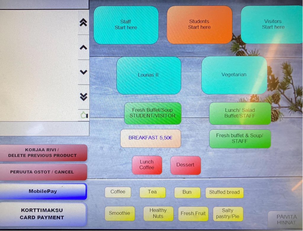
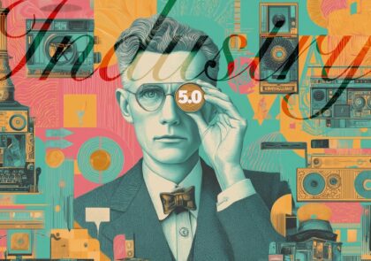
Image 2. An uncalm customer terminal UI in the cafeteria of Aalto University makes one wonder where to focus attention in the interface. Confusing UI design can add length to queues and increase the need for staff. (Photo: Ville Tietäväinen)
Calm tech has a vast potential application; let’s imagine, for example, the case of reading in the 2020s. Reading books demands focusing, and it benefits from a distraction-less environment, but multi-windowed and heavily linked web interfaces provide quite the opposite. At the same time, we are worried about the decrease in reading, and it is evident that our ability to concentrate has weakened (Carr 2010). It is difficult to focus on an e-book when TikTok, Twitter and Facebook offer instant gratification with algorithms and send notifications during reading. Canadian media researcher Christian Vandendorpe (2013, 117–118) speaks of grazing, which he defines as the uninterrupted appropriation of a long text or part of it; other forms of reading include browsing and searching for information. Grazing is a typical way of reading a paper book, as browsing and searching for information are characteristic of the web.
Carr (2010) even claims that short Internet articles fragment how you process information – your brain will adapt to the short focus. Content on the internet stimulates different neural zones than reading printed material. In fact, the brain is hardwired for distraction; the more you are distracted, the more distraction your mind craves. Maps and clocks changed how people perceived space and time, the Internet has changed us, too.
This all can and must be unlearned for us to become more productive. And calm tech can be a path to it. We need digital interfaces that cater better for grazing-type reading.
Evolution of design principles follows evolution of tech
Each generation of ICT has its challenges and corresponding design practices to deal with them. The 1990s saw the rise of usability and accessibility. Jacob Nielsen (1995) created basic rules and heuristics to make the interaction between the new personal computer and its user possible. The bilateral relationship became more multilateral when computers connected with each other, and the information was presented on linked web pages – and finally, with social media, people connected with each other through computers. The shrinking of computers into touchscreen mobile devices was a big game changer in the 2010s. The heuristics of good UI practices adapted to different screen sizes and interactivity. Still, the rules for good social media practices are harder to create because it is basically a connection between humans mediated by algorithms. The significant change of the current decade is IOT, where network technology reaches everyday objects and this trend has no end in sight. Hence, there is a societal need to create rules of conduct for the ubicomp era.
Relation to other initiatives: the vanishing computer
The need to design information with human principles has emerged in response to unnecessary complexity. Donald Norman (1999) figured out that in the future, we need a simpler and more direct way to operate with our tasks as can be done with desktop computers, which he saw as a vanishing interface to information. He claimed that at the mature level, ICT would get rid of all heavy technological burdens as unnecessary and foresaw the rise of ”smart appliances” like Personal digital appliances (PDAs) to replace PCs – and with these small connected and dedicated devices, he as a matter of fact described the IoT. True enough, from the graphical user interface, we have moved towards Natural User Interfaces (NUI), where the interface mimics the human way of interaction and can be controlled with gestures, speech, touch, and facial expressions. While another contemporary initiative, the Zero-interface (Iqbal & Campbell 2021) is quite close to NUI. The No-Interface movement (Krishna 2015) takes a step forward; the ideal is to eliminate the user interface entirely between the person and the service.
Of course, this is practically impossible, as rebutted by Timo Arnall (2013). The Calm tech is not about unrealistically getting rid of the interface altogether but instead making it minimal. Calm technology, which argues that computing systems should simplify complexities, not introduce new ones, could be an umbrella of the thoughts presented here. Still, it also has a qualitative emphasis: good technology should be discreet – the very opposite of intrusive. I also find the ethos of Shikake (Matsumura et al. 2015) as related to the topic. Shikake is a design principle where the user is guided to make desired choices in a friendly and non-jostling way.
Most recently similar ideas have been noticeably promoted by Tristan Harris, former Google Design Ethicist, with a call to minimize distraction and respect users’ attention, however, Harris goes well beyond technology with a more ethical and socially aware approach. (Human tech 2018).
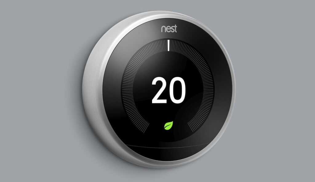
Image 3. Example of minimalistic and calm IOT design: digital thermostat by Nest. (Image: The Next web 2021)
The proposed principles of calm tech
But how? Case (2015) proposed eight general principles clarifying what calm tech is all about: it is not only about UI/UX-design, it deals with something more general and profound.
I. Technology should require the smallest possible amount of attention.
II. Technology should inform and create calm.
III. Technology should make use of the periphery.
IV. Technology should amplify the best of technology and the best of humanity.
V. Technology providers should understand that minimalism can also further accessibility and sustainability.
VI. Technology should work even when it fails.
VII. The right amount of technology is the minimum needed to solve the problem.
VIII. Technology should respect social norms.
The proposed checklist for calm tech
However, we also need a concrete list of how to implement these principles. As a work in progress, I have taken the liberty to take the directions above to a more pragmatic level as a list of good practices. The dos and don’ts list is derived from calm tech principles and combined with classic user interface heuristics (Nielsen 1995) updated by my research work (Heikkilä 2012).
Calm is here to combine the lowest cost with the highest gain.
| DOS | DONT´S |
|---|---|
| SUPPORT EASY NOTIFICATION MANAGEMENT | Do not support notification management, and if you do, hide the preferences deeply. |
| SUPPRESS DEFAULT NOTIFICATIONS TO THE MINIMUM. | Create notification loops requiring constant actions. |
| SHOW ONLY RELEVANT INFORMATION IN THE RELEVANT NUMBER OF SCREENS, AND SUPPORT NATURAL NAVIGATION BETWEEN THEM. | Publish rarely needed and irrelevant information and create an idiosyncratic way of moving around the interface. |
| WRITE IN PLAIN, USER-FRIENDLY LANGUAGE. | Use lots of idioms and complicated, long sentences to fill the space. |
| USE SIMPLE, FUNCTIONAL COLOR SCHEME. | Favour flashy decorative images and colors. |
| MAKE INFORMATION ACCESSIBLE WITH MINIMUM NUMBER OF STEPS. | Bury information to pop-ups and downloadable PDFs. |
| CREATE LAYOUT WITH HIERARCHY GUIDING THE EYE. | Create a uniform wall of text spread the content randomly to the page to create confusion. |
| CATER FOR ”GRACING”-TYPE OF READING. | Use distracting animations, pop-ups and links. |
| SUPPORT MINDFULNESS AND POLITENESS. | Create uncivil algorithms favoring confrontation and vexation. |
| ASK YOURSELF WHAT PROBLEM THE NEW SERVICE SOLVES AND HOW THIS HELPS THE EVERYDAY LIFE OF THE USER. | Launch a new indifferent service with merely intrinsic value to solve problems of previous indifferent services |
References
Arnall, T. 2013. No to NoUI. Cited 28 Aug 2023. Available at http://www.elasticspace.com/2013/03/no-to-no-ui
Case, A. 2015. Calm Technology: principles and patterns for non-intrusive design. Beijing: O’Reilly.
Carr, N.G. 2010. The shallows: how the internet is changing the way we think, read and remember. London: Atlantic Books.
Heikkilä, H. 2012. Towards tablet publication heuristics. Helsinki: Next Media.
Human tech. 2018. About us. Cited 7 Sept 2023. Available at https://www.humanetech.com/who-we-are
Iqbal, M.Z. & Campbell, A.G. 2021. From luxury to necessity: Progress of touchless interaction technology. Technology in Society. Vol. 67, 101796. Cited 4 Sept 2023. Available at https://doi.org/10.1016/j.techsoc.2021.101796
Kay, A. 1972. A Personal Computer for Children of All Ages. Xerox Palo Alto Research Center.
Kahneman, D. 2011. Thinking, fast and slow. New York: Farrar, Straus and Giroux.
Krishna, G. 2015. The Best Interface Is No Interface: The simple path to brilliant technology. San Francisco: The New Riders.
Matsumura, N., Fruchter, R. & Leifer, L. 2015. Shikakeology: designing triggers for behavior change. AI & Society. Vol. 30 (4), 419-429. Cited 1 Sept 2023. Available at https://doi.org/10.1007/s00146-014-0556-5
Nielsen, J. 1995. 10 Usability Heuristics for User Interface Design. Cited 2. Sept 2023. Available at https://www.nngroup.com/articles/ten-usability-heuristics/
Norman, D.A. 1999. The Invisible Computer: Why Good Products Can Fail, the Personal Computer Is So Complex, and Information Appliances Are the Solution. Massachusetts: MIT Press.
The Next Web. 2021. At last! Google’s Nest Thermostat will play nicely with Siri and Alexa. Cited 22 Aug 2023. Available at https://thenextweb.com/news/google-nest-thermostat-work-with-apple-siri-amazon-alexa
Vandendorpe, C. 2009. From papyrus to hypertext: Toward the universal digital
library. Urbana: University of Illinois Press.
Weiser, M. & Brown, J.S. 1995. Designing Calm Technology. Xerox PARC. Cited 21 Aug 2023. Available at https://people.csail.mit.edu/rudolph/Teaching/weiser.pdf
Weiser, M. & Brown, J.S. 1996. The Coming Age of Calm Technology. Xerox PARC. Cited 22 Aug 2023. Available at https://people.eng.unimelb.edu.au/vkostakos/courses/ubicomp10S/papers/visions/weiser-96.pdf
Wikipedia. 2023. Flaming June. Cited 1 Sept 2023. Available at https://en.wikipedia.org/wiki/Flaming_June
Author
Harri Heikkilä, PhD, MSc, is a principal lecturer of visual communication at the LAB University of Applied Sciences Institute of Design and Fine Arts. He working as an expert in LAB customer experience development platform, where calm tech is a one of the research topics.
Illustration: Flaming June, an 1895 painting by Frederic Leighton. (Wikipedia 2023, image manipulation by Harri Heikkilä)
Published 25.9.2023
Reference to this article
Heikkilä, H. 2023. Towards unifying human design principles for the IOT-era. LAB RDI Journal. Cited and date of citation. Available at https://www.labopen.fi/en/lab-rdi-journal/towards-unifying-human-design-principles-for-the-iot-era/